How to implement PageView in SwiftUI?
tabs If you come from a UIKit background, you are going to be really surprised how easy
it is to implement a UIPageController using SwiftUI.
To achieve, this we will be relying on the TabViewStyle modifier.
This modifier is used to set the tab view style to .page, which enables paging behavior. This allows the user to swipe between the different pages of content.
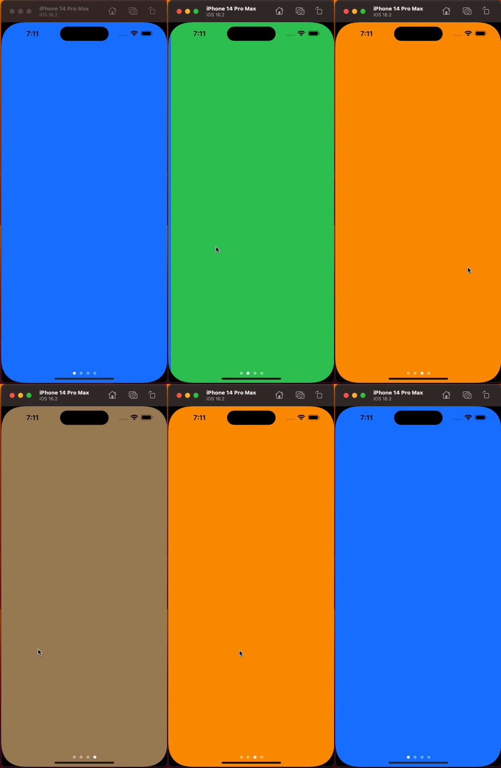
In this example, we will be swiping between 4 colors.
struct PageView: View {

    var body: some View {
        TabView {
            Color.blue.ignoresSafeArea()
            Color.green.ignoresSafeArea()
            Color.orange.ignoresSafeArea()
            Color.brown.ignoresSafeArea()
        }.ignoresSafeArea()
        .tabViewStyle(.page)
    }
}
The ignoresSafeArea() modifier is used to allow the views to extend under the safe area (the area around the edges of the screen that is reserved for the status bar, notch, and other system UI).
If you come from a UIKit background and are wondering how to change the tint color of the page indicator tint color in SwiftUI, you are going to have to rely on the appearance method at time of writing this post.
In your PageView struct add this in the init to achieve this.
struct PageView: View {
  init() {
    UIPageControl.appearance().currentPageIndicatorTintColor = UIColor(Color.primary)
    UIPageControl.appearance().pageIndicatorTintColor = UIColor(Color.secondary)
  }
}
That’s all you need to get started with PageView in SwiftUI.
