How to display ColorPicker in SwiftUI
pickers Color Picker is a great control in SwiftUI that provides us a way to give the user the access to choose a new system color and
display a currently selected color.
The color picker accepts a Binding variable that maintains the currently selected color.
In our example we will give the user the option to choose a system color and update the view with their newly chosen color.
struct ColorPickerView: View {
    @State var chosenColor: Color

    var body: some View {
        ZStack {
            chosenColor
            HStack {
                Spacer()
                ColorPicker(selection: $chosenColor, supportsOpacity: false, label: {
                    Text("Choose Color")
                })
                Spacer()
            }
        }.edgesIgnoringSafeArea(.all)

    }
}
We can then initialize our ColorPickerView with a default chosenColor.
ColorPickerView(chosenColor: Color(red: 0.1, green: 0.6, blue: 0.9))
Once the user selects choose color the color selection view will be displayed as a sheet.
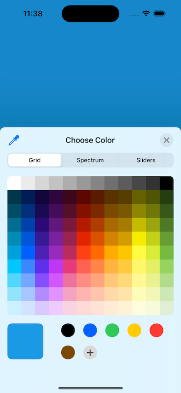
Our view will then be updated to display the selected color as the background of
our ZStack. If you want to provide the user the ability to change the opacity,
pass true for the supportsOpacity property.
Sponsored