Create a chart using Swift Charts
charts In WWDC 22 the new Swift Charts framework was announced and it has never been easy to create beautiful Charts. You will need Xcode 14 installed which at the time of writing is in Beta. Let’s get right to it..
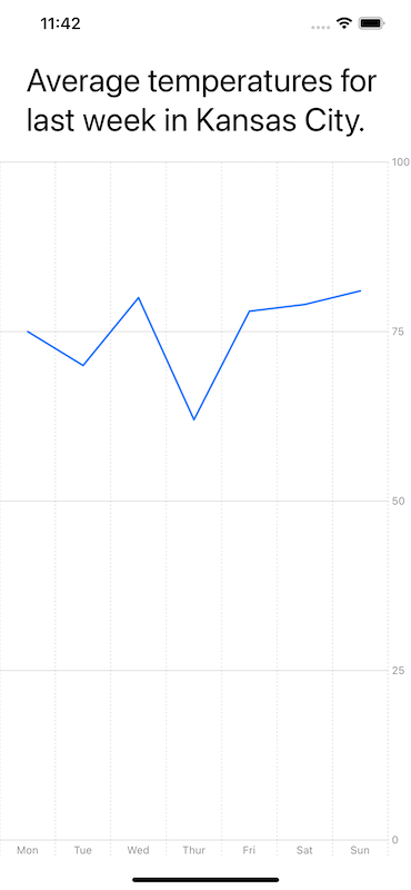
In this example, we will show a graph of the average temperatures in Kansas City for the last week. We will create a struct which will hold the day of the week and the average temperature for that day respectively. These will be our X and Y axes on the chart.
struct TemperatureTrend: Identifiable {
  var day: String
  var value: Double
  var id: String { return day }
}
Next we will create an array that will hold temperatures for all days Monday thru Sunday.
let data : [TemperatureTrend] = [
  .init(day: "Mon", value: 75),
  .init(day: "Tue", value: 70),
  .init(day: "Wed", value: 80),
  .init(day: "Thur", value: 62),
  .init(day: "Fri", value: 78),
  .init(day: "Sat", value: 79),
  .init(day: "Sun", value: 81),
]
You can create various types of Charts using the new Charts framework. We will create a Line Chart which will display the average temperature trend over the week.
struct ChartView {
  var body: some View {
    Text("Daily temperatures for last week in Kansas City.")
    Chart(data) {
      LineMark(
          x: .value("Day", $0.day),
          y: .value("Temperature", $0.value)
        )
    }
  }
}
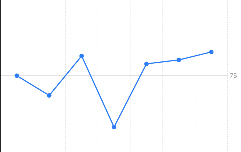
We can also represent data using points on the Line chart. Swift Charts framework allows us to combine Marks.
Chart(data) {
    LineMark(
        x: .value("Day", $0.day),
        y: .value("Temperature", $0.value)
    )

    PointMark(
        x: .value("Day", $0.day),
        y: .value("Temperature", $0.value)
    )
}
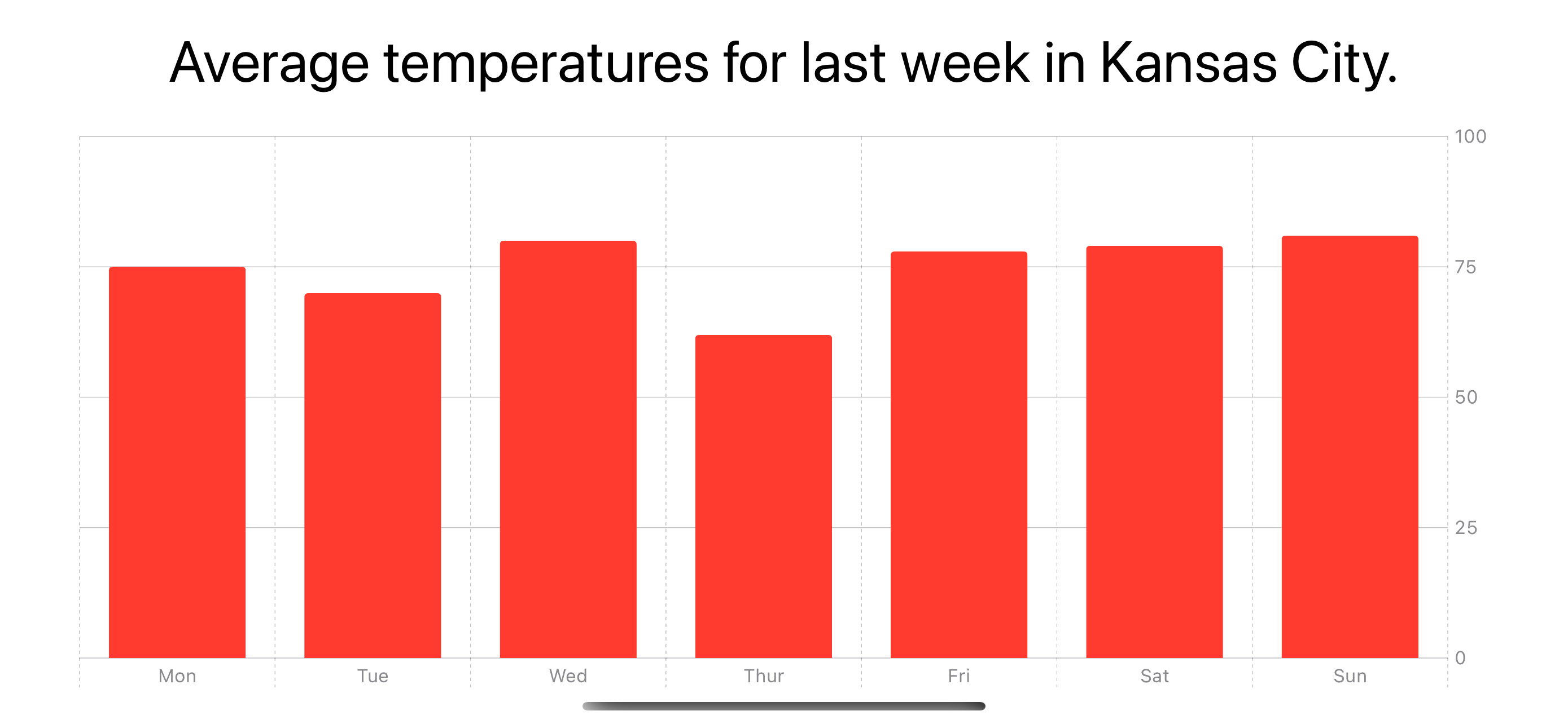
Sometimes, showing these temperatures as Bars for each day might make more sense. You can easily do this by
switching LineMark struct with BarMark.
BarMark(
    x: .value("Day", $0.day),
    y: .value("Temperature", $0.value)
  )
If you want to now add a color to your bars or line chart you can use the foregroundStyle modifier.

Chart(data) {
    BarMark(
        x: .value("Day", $0.day),
        y: .value("Temperature", $0.value)
    )
    .foregroundStyle(.red)
}
And that’s pretty much what you need to get started with Charts.
